Arctic Explorers Museum Exhibit

This project focused on creating an interactive exhibit for kids and families. The purpose of Arctic explorers was to bring the extreme habitat of the Arctic to life without having to experience the frigid temperatures and to learn about what this environment has to offer.
From the deep sea to the tip of a glacier, visitors are able to interact and play with the exhibit from start to finish.
Programs used
Figma: Used to create high and low-fidelity mockups of the Arctic Explorers app and website. Gathered assets from the Figma community to enhance the usability of the platform.
Ps: Used to create wayfinding mockups for museum exhibit building and editing/cutting out images for the header of the website.
Canva: Used to create AI images, wayfinding mockups, moodboards, and edit image assets.
ChatGPT: Used to create images and simplify my museum concept
Gemini: Used to create images and help in the creation of my app concept ideation.
Beginning the Design Process
The beginning of this project started with curating what I wanted my exhibit to feel like. I gathered images from Pinterest and used Canva to create the actual mood board. This helped in order to keep a consistent feel throughout the semester-long project. As you will see throughout the project, there are several things that do change in order to adhere to specific guidelines and the overall function of the project.
Mood Board Inspiration
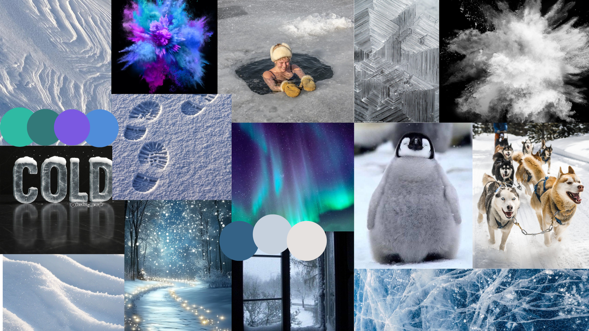
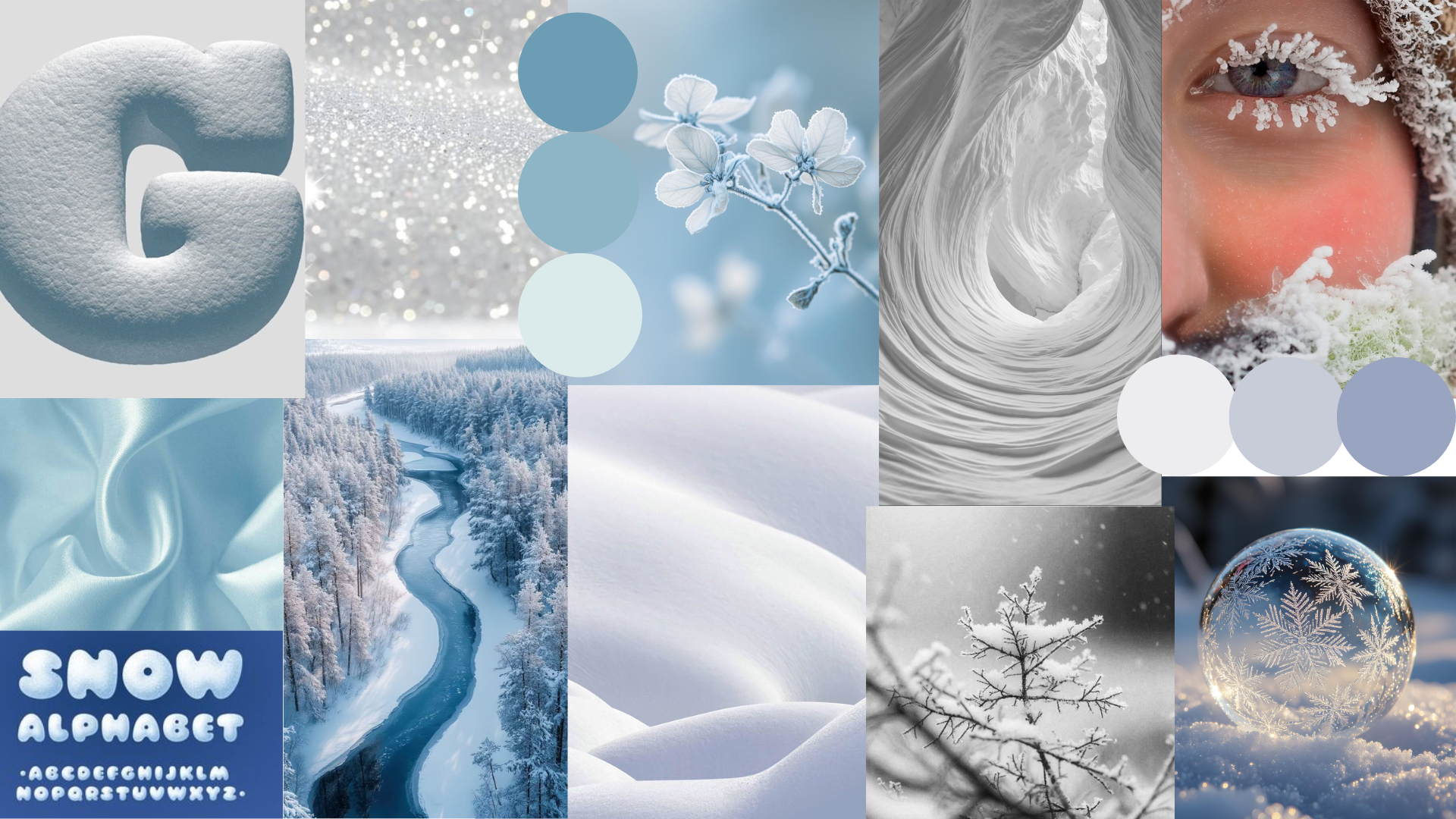
For the first mood board, I wanted to show Antarctica more at night and the energy surrounding it. I wanted to show how things out in the wild might be awake at night, and that there is so much life even somewhere where it is cold. Portraying the sounds of stepping in snow, the excitement of getting in cold water, or seeing animals, and the awe of the northern lights. This mood board is meant to have more jagged and harsher lines of the ice. My Target audience is kids and families to be able to experience the array of colors and life that even exists in the north. I want them to be able to bring them somewhere so cold and not somewhere most people would visit right to them as if they were there through this exhibit.
I chose a font that literally looked like ice because I wanted to portray this cold feeling, as well as the blockiness of the font. As for the colors, I want to include the colors of the northern lights because that is where they are normally seen, but because it is such a hard place to get to, not many people get to experience them. I want the overall design language to be awe-inspiring for my audience.
In my second mood board, I wanted this to portray the light, airy, and soft feeling compared to my first example. I wanted this to feel calming and more awake, but still have a soft feeling to it. My target audience would be again kids and families, but I want this to make them feel relaxed and calm, while still having fun. I decided on adding fonts that are more rounded and look like actual snow to portray this feeling of friendliness and lightheartted and fun. Much less serious than my first mood board.
The colors are meant to be brighter and more monochrome for cohesivity and to provide the audience less distraction with colors and focus on maybe how they feel overall instead. I want them to walk out of this exhibit feeling more relaxed than they came in, using the colors and the softness of the curves of design.
Ai Graphic Design Iterations
After figuring out what I wanted me exhbnit tp look like, I then needed to make a hero image and other images I may want to use later on. Using AI platforms such as ChatGPT and Gemini, I wrote a very descriptive prompt in order to make images that I could use for my website.
ChatGPT Images
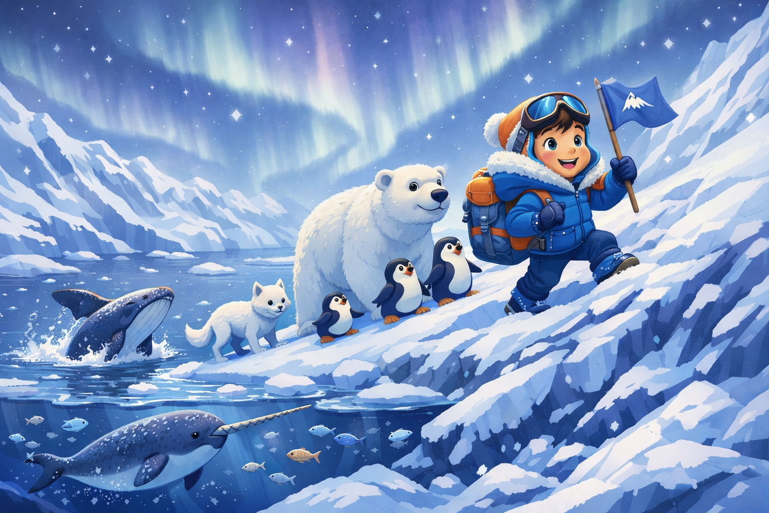

This eventually turned out not to be what I wanted my images to look like because they look too cartoonish, and I went the more realistic route because I felt like it gave the user a better user experience from start to finish.
ChatGPT Images for The Exhibit and App
Prompt Used: One young kid in Antarctica, poking their head out of an igloo, and it will be cartoon styled. There will be arctic animals like a penguin, polar bear, white fox, and a yeti also poking their head out of the igloo door with the kid. There will be penguins surrounding the igloo, with a body of water behind the igloo with a whale and a narwhal, with a tall Antarctic mountain in the very distant background. The aesthetic will be 3d rendering and include light blues and whites, with deep blues for contrast. It will be snowy and cold-looking.
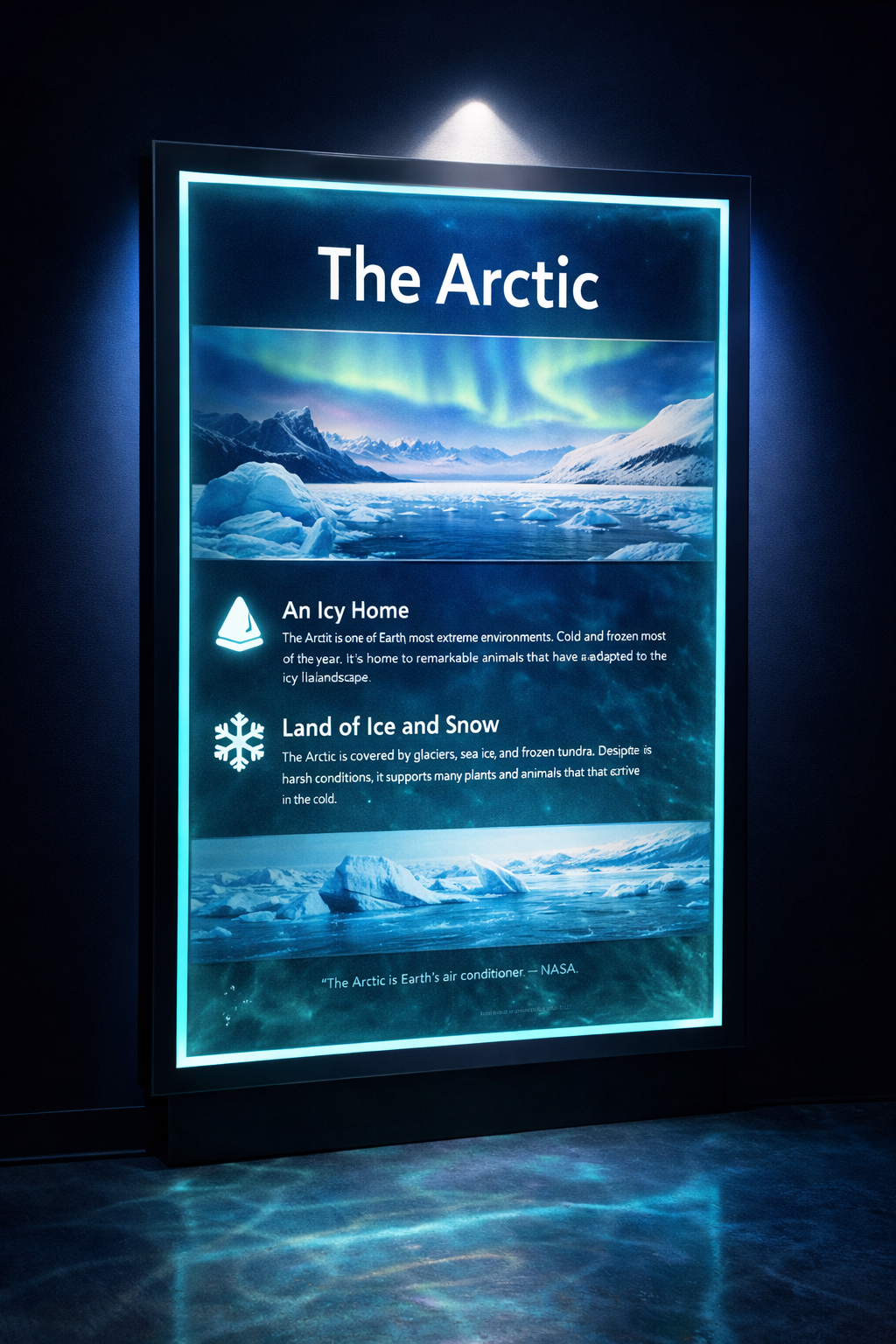
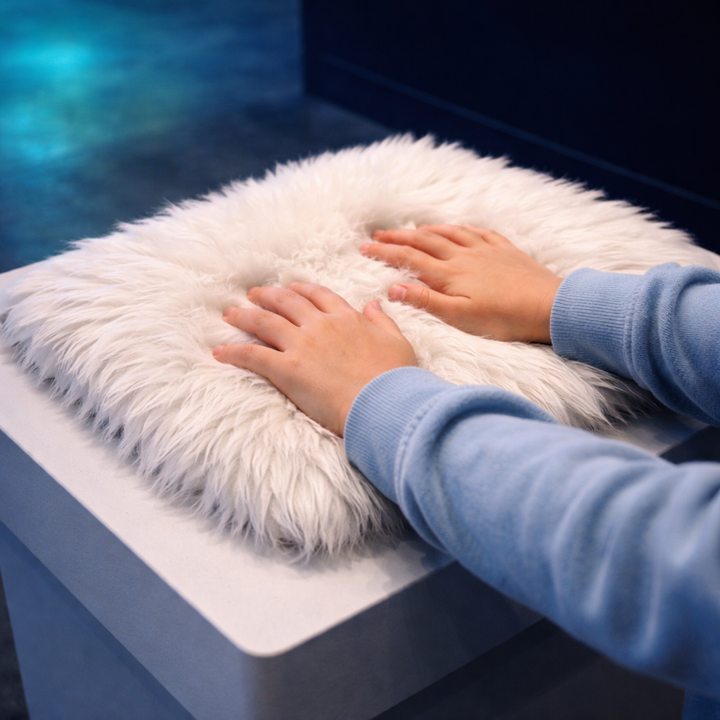
Prompts Used:
Close-up photograph of a sleek illuminated museum display panel, arctic theme, glowing teal and blue backlit information panel with arctic landscape imagery, dark navy background, dramatic spotlight from above, clean modern design, professional museum photography, photorealistic, 8k
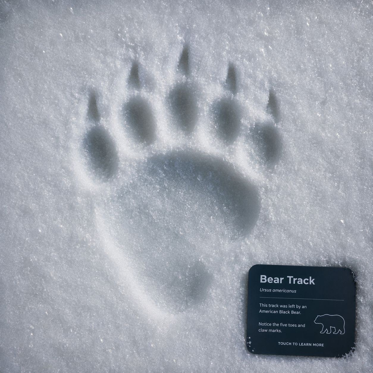
Close-up photograph of a child's hands touching soft white polar bear fur on a museum tactile station pedestal, soft blue and teal museum lighting, dark navy background, warm, inviting glow, professional museum photography, photorealistic, 8k
The paw print is used in the app for the exhibit. The app displays several different pawprints, but because I wanted each of them to be cohesive, I used ChatGPT to mock up each animal’s pawprint.
Exhbit Walkthrough
How will visitors interact with the exhibit?
They will interact by being able to touch the fur of animals, learn about the activities done in Antarctica, a fishing activity (I am thinking virtual) to see what kinds of fish live there, and an image and info will pop up, and I am going to include buttons for the animals that kids can press to make noise of each animal. In each room, they are able to play and customize the lights on a device in the room (changes every 3-4 mins). As well as all about glaciers and their history, kids can do a size comparison. The first room is about the land animals, the second room is about the marine animals, the third room is about glaciers, and the last room is about the effects of global warming, adding something that kids can do that is fun, like popping bubbles, to not let CO2 reach the animals. or a game that I could add to turn all the lights off to conserve energy, and an ice crystal will grow larger and larger.
How will they engage with the app?
They are going to do a scavenger hunt that collects all the different animal footprints throughout the exhibit as well as when they complete an activity and the scannable code comes up they will recieve a badge for each thing they completed and “it will break that ice at the end” I am thinking they may get a small gift at the end to take home but only once they get the code from the ice breaking. (They are supposed to be like rangers on an expedition for animals and also conservation. I also kind of want the walls along the inside to be see-through, almost, and have snow animated coming down to make it feel as if they are actually in Antarctica.

App and Web Design Process
App Sketches and Low-Fidelity Wireframes
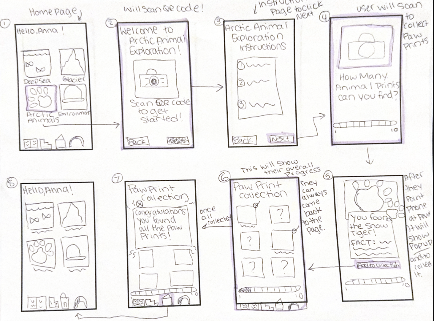
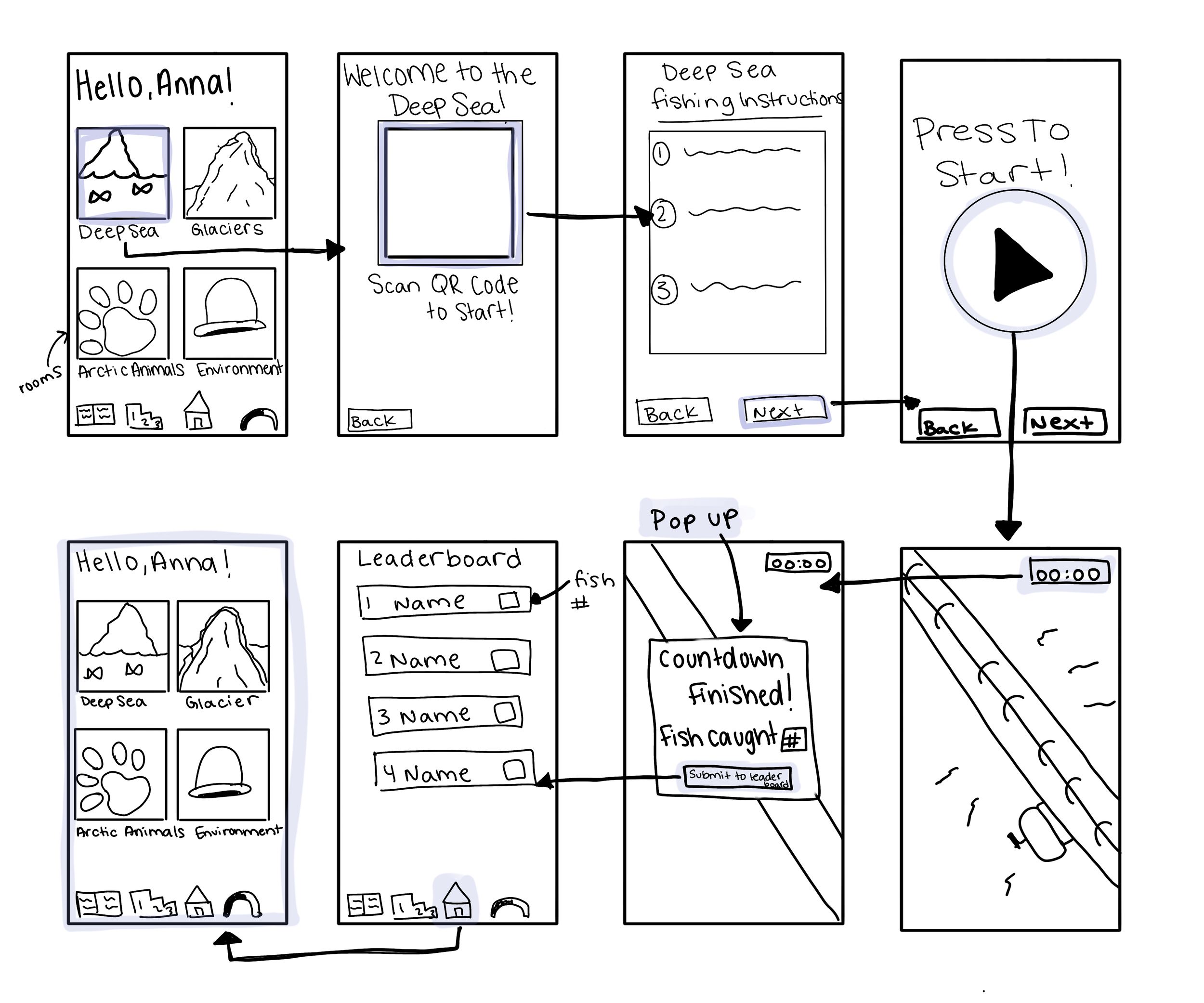
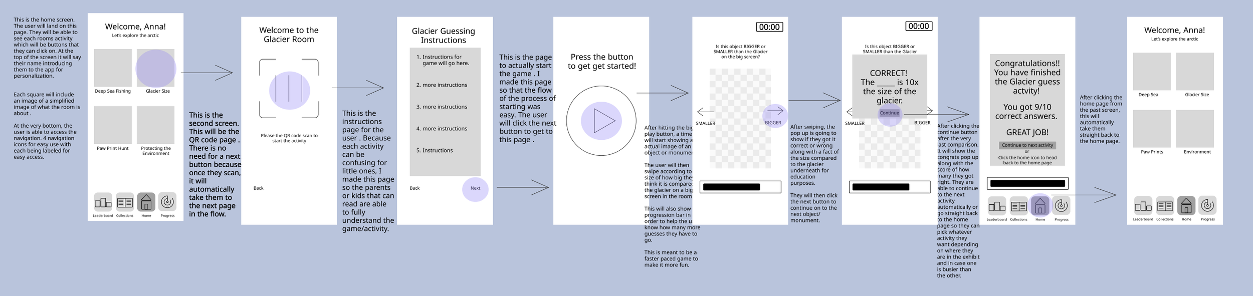
The web and mobile design started with the bare bones of hand sketching what I wanted each platform to look like. Here you can see my hand-drawn wireframes for my exhibit app. The app is directly connected to the echbit, which the user will interact with using the app to play games on their mobile device.

On this screen, the progression was added because several users wanted to be able to see their progress
App Protype Revisions After Feedback
Website Sketches and Low-Fidelity Wireframes

This screen was completely newly added due to its absence in earlier versions. Users found that clicking on the global navigation button for progression did not work, which is why this was fixed.
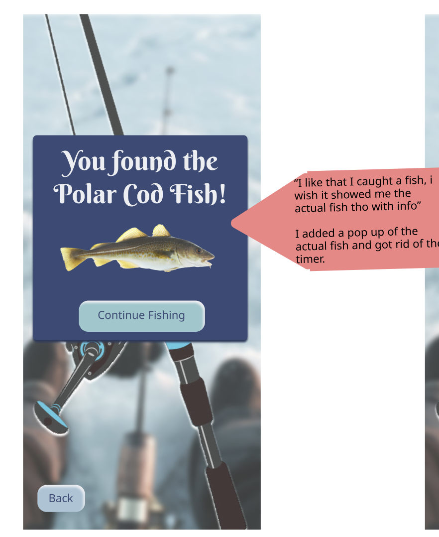
Users liked that they caught a fish, but would have liked more information. I ended up adding an image of the fish because I wanted it to be more visual, as they are continuously catching fish during this activity.
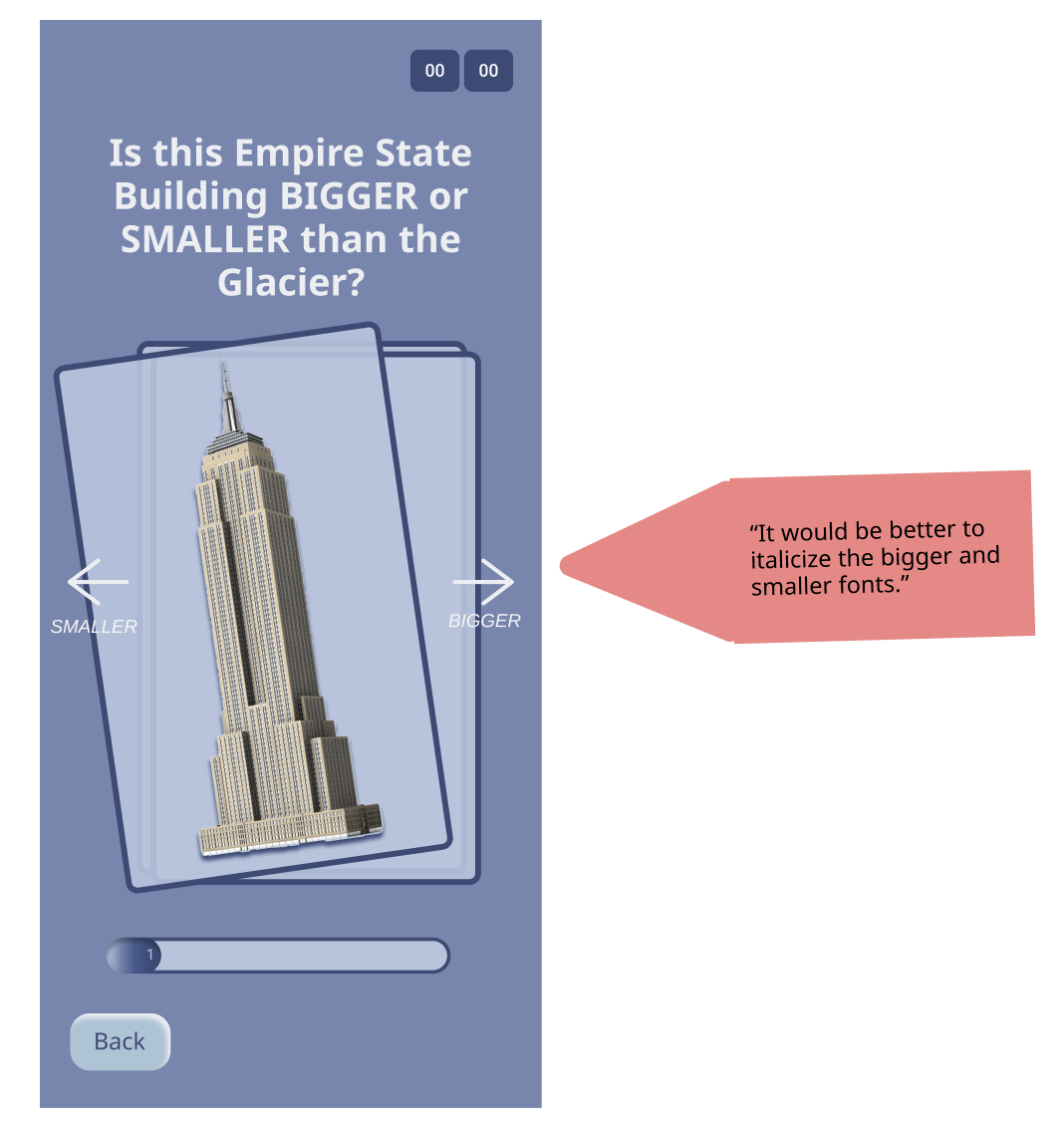
On this screen, users mentioned that there was not enough contrast, so each direction was put in an italic font and made smaller.
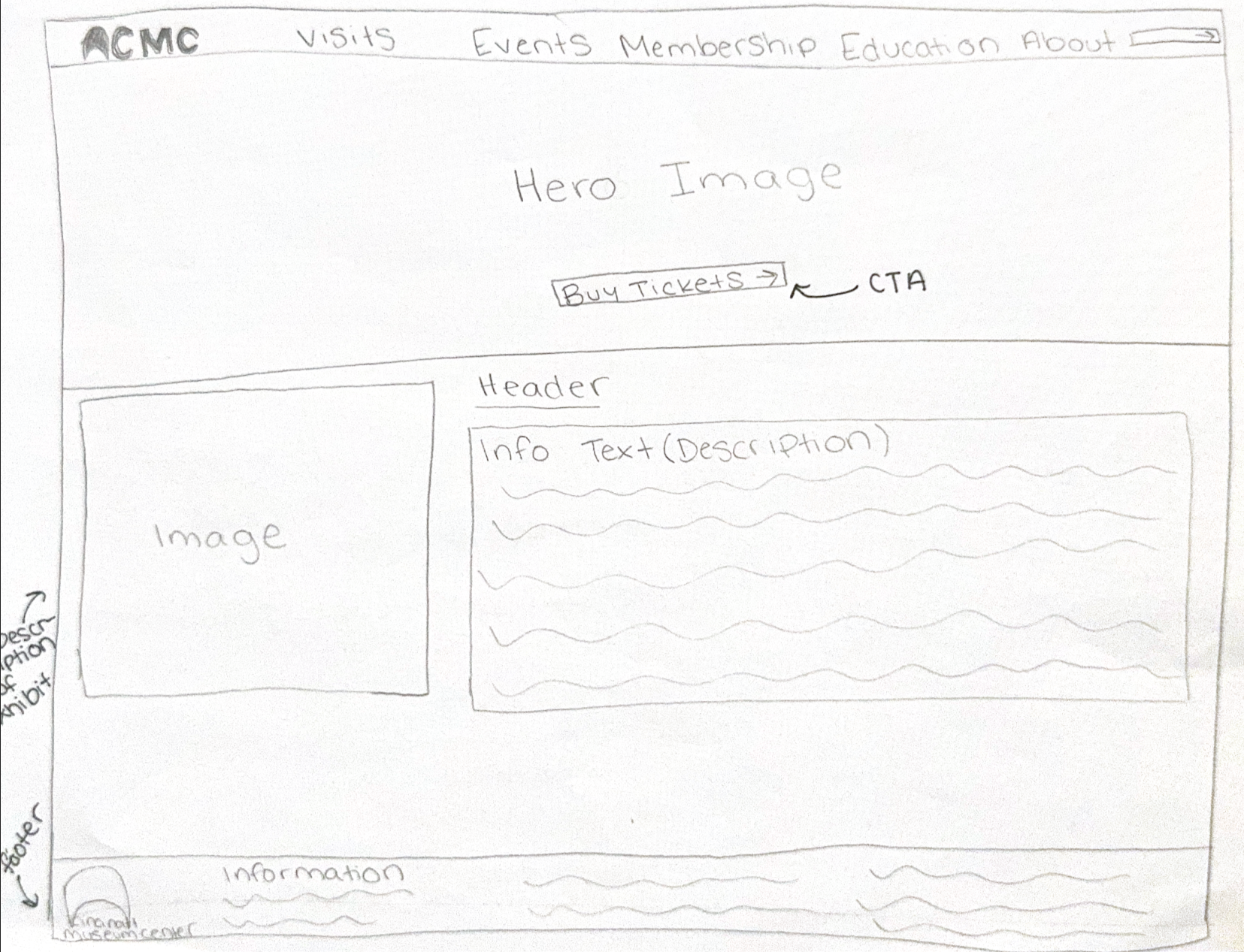
Here you can see that to begin the web design, I started off with hand sketching each page for my website idea. I began with the main page with the hero image, with boxes where images would be placed.
Each main attribute on the low fidelity is labeled for easy usability and to make sure each one has clear reasoning.
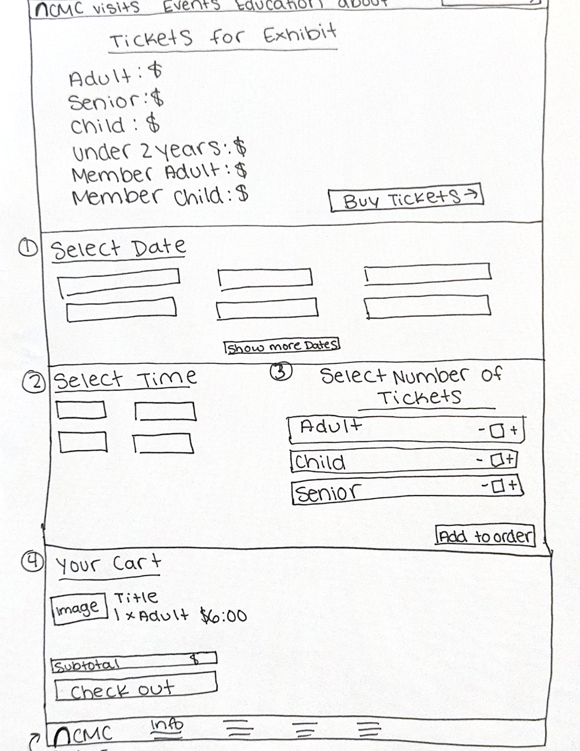
App High Fidelity Wireframes
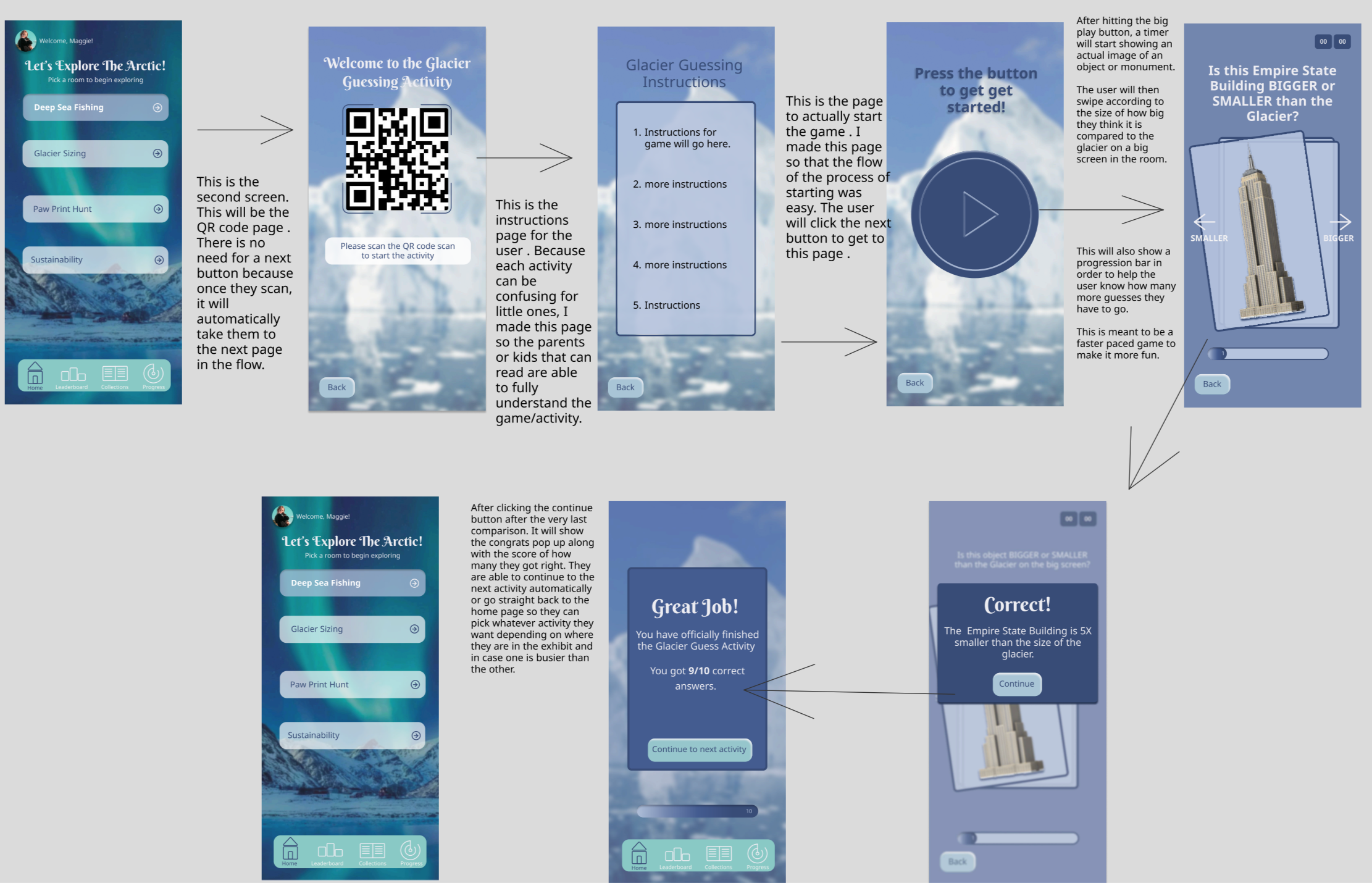
This shows the high-fidelity mockups with notes explaining what each screen does, and this includes a mockup of the app on an iPhone. Each activity is a button, which the user begins the activity with instructions. The app itself connects directly to the exhibit, so whatever the app shows or initiates, the phone will collect the data from the user.

The app includes a global navigation for easy use, and interactive elements such as a leaderboard and a collections book that the user can always go back to.
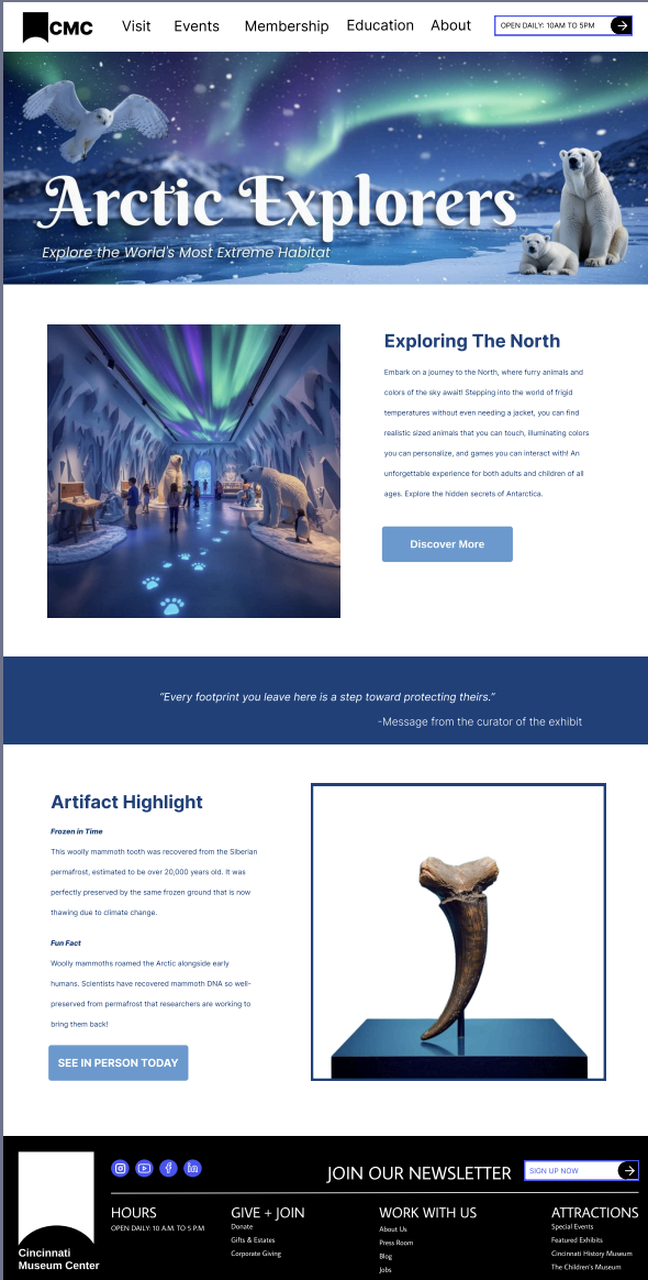
Website High Fidelity Wireframes
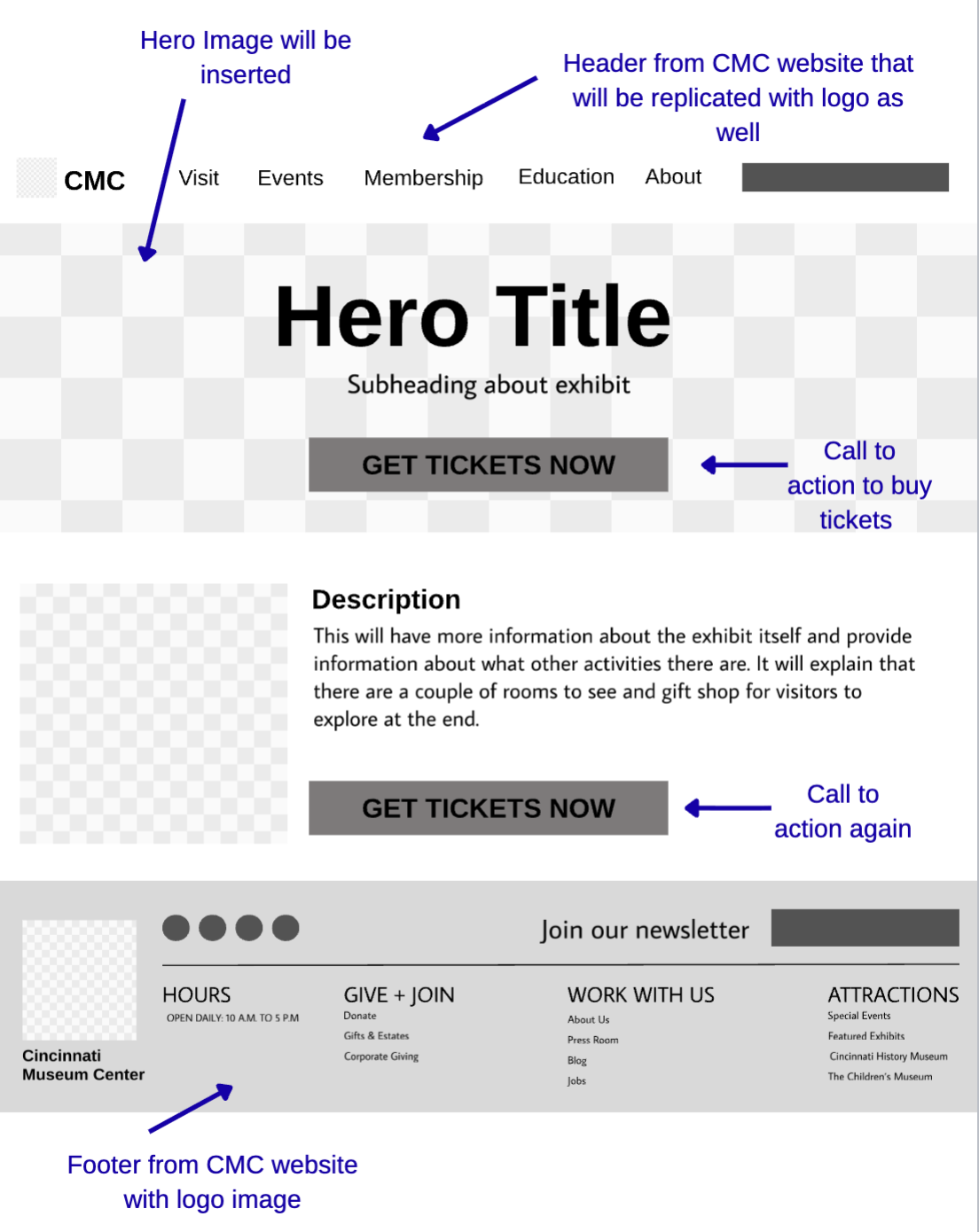
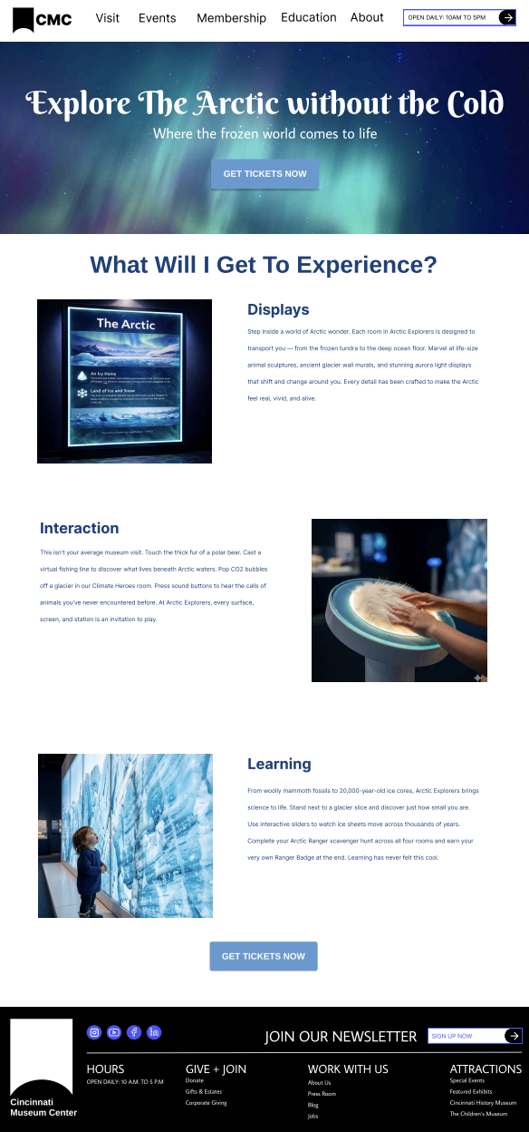
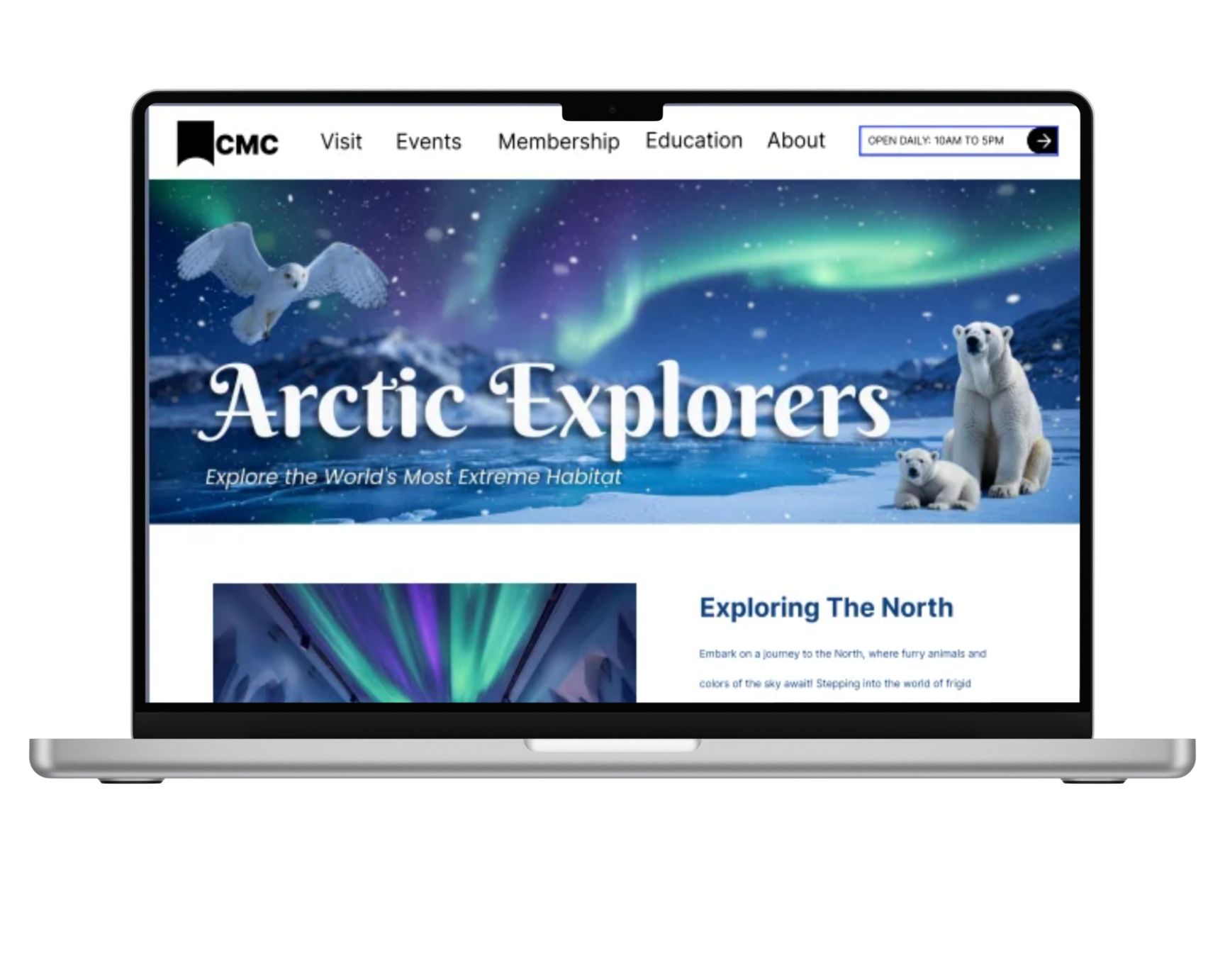
After finalizing my website sketches and low fidelity, I created the hero image and Ai images to curate a well-planned-out website that includes information and easy navigation for the user.
This website includes information for each room and includes information regarding the exhibit itself. The user can also learn more about Arctic artifacts and even purchase tickets.
I then draw out the second page of the website, which is where the visitor would get more in-depth information about the exhibit. After this, I then created my ticketing page to showcase the usability of getting an actual ticket to Arctic Explorers.
Wayfinding Elements
Wayfinding elements were also created. These were made using the same color scheme and would be shown in the exhibit as the user walks through it. Wayfinding elements are important to have in order for the user to properly find their way around a space. In order to catch the attention of the person in the echbit, the same fonts and colors were used along with characters that were used in the hero image, making it all cohesive.
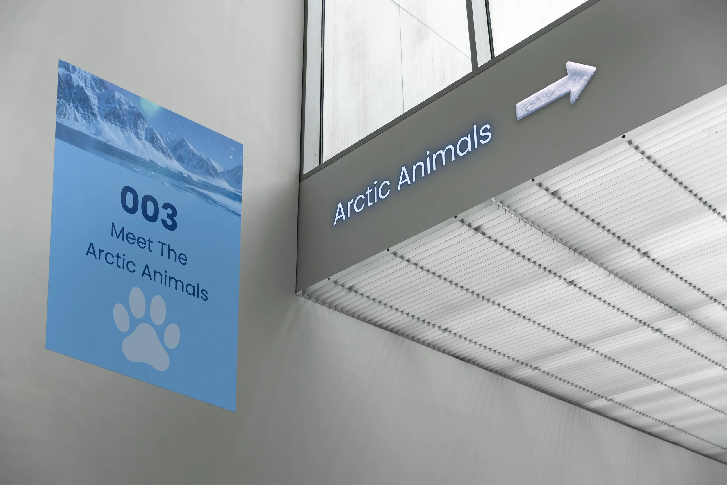
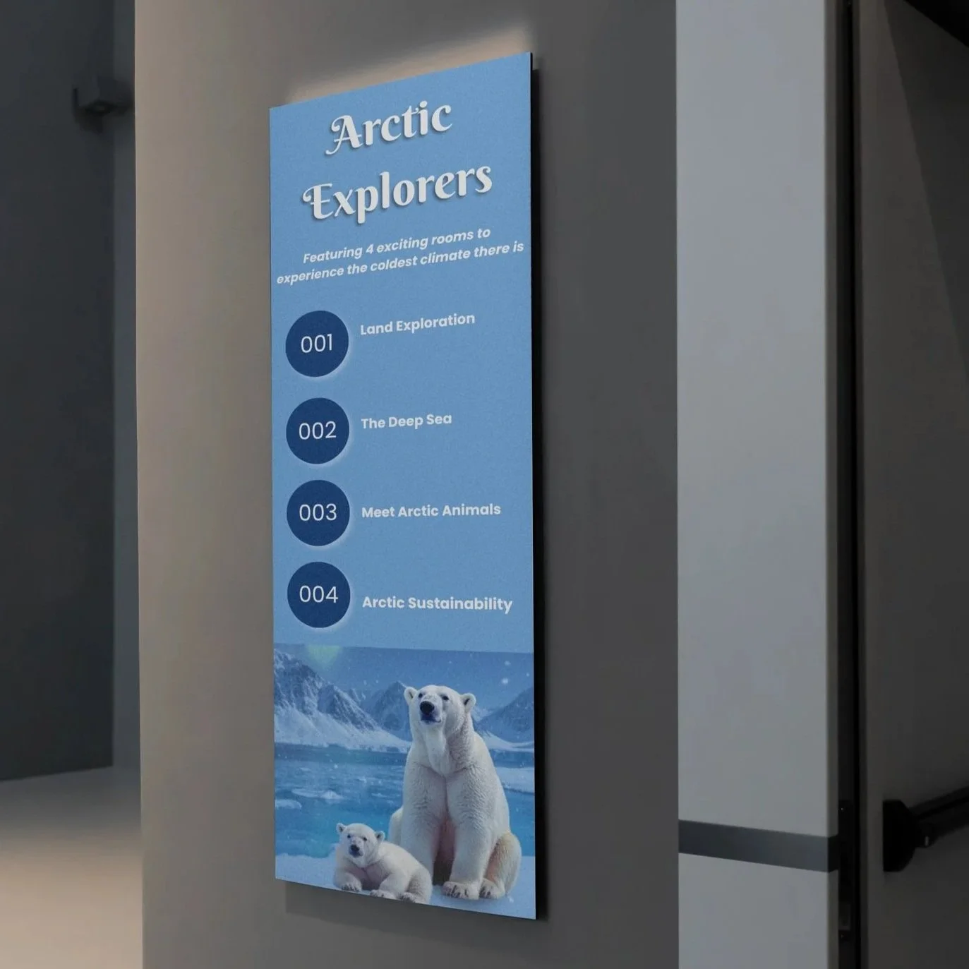
Arctic Animals Signage: This directs the visitors to the Arctic Animals room. Most of the building wayfinding has a specific icon for easy idenitfication and wayfinding. Because this is for the animals, it has the paw icon to identify it. It uses the same landscape image above, which is used across each wayfinding element in some way.
Floor Level Signage: This uses the same typography as the hero image on the website for cohesiveness and easy wayfinding. Everything feels like it is part of the same exhibit using the same colors, font, and characters.
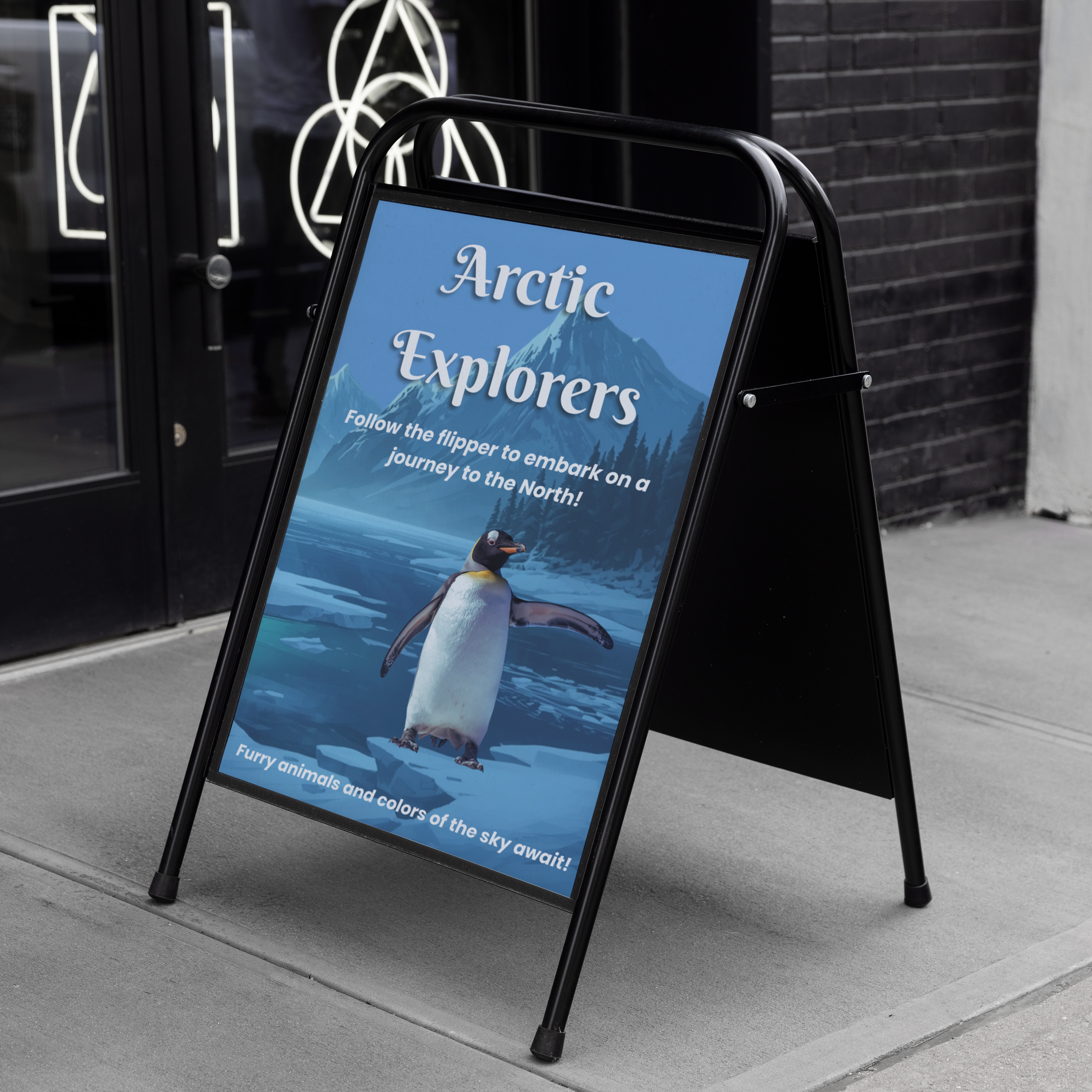
Outside Signage: This directs the visitors to the exhibit from outside. Because it is the first thing they see, it is the most visible of the wayfinding elements. The background was from a past image and was turned down in opacity. It uses the same fonts as the main hero image, and the penguin was made using Canva AI to get the flipper to be pointing. I used the penguin because it was the most eye-catching and visually interesting for a younger audience.
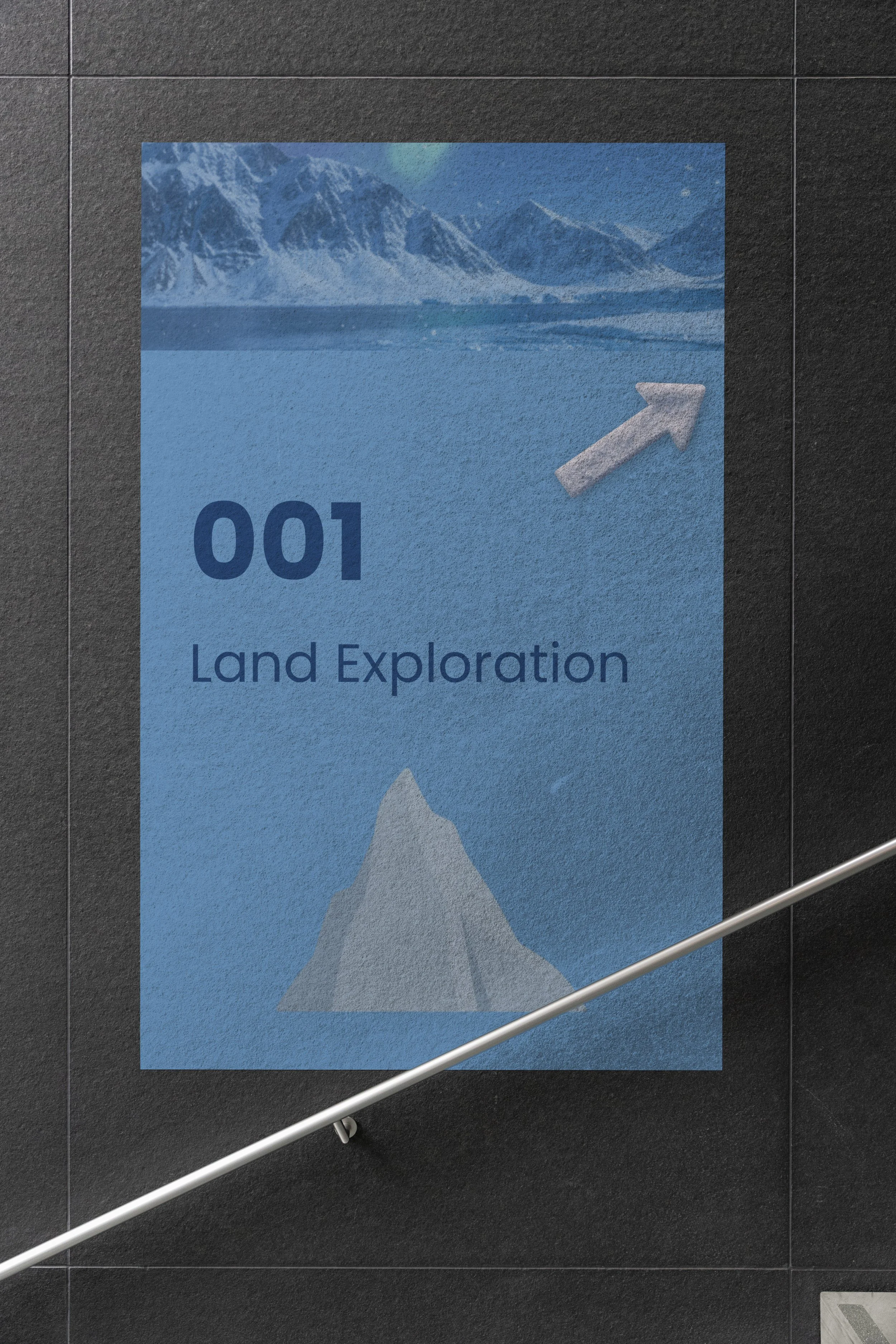
Steps Poster: This uses the same typography as the hero image on the website for cohesiveness and easy wayfinding. Everything feels like it is part of the same exhibit, using the same colors, font, and characters. This uses the same navy for easy readability, and the arrow is used across all the wayfinding when needed. The arrow was created using canva Ai.